Part Three: Block out the shape.
Scan your sketch
OK, if you haven’t already, I recommend scanning in your sketch and opening it in Photoshop. If you don’t have access to a scanner you may download mine below.
For the purpose of this exercise I’m going to assume you used mine.
Start blocking out your shape
Open the sketch image.
Make a new folder above the sketch layer.
Name this folder construction. Or something similar.
Select the construction folder and set the opacity 55%.
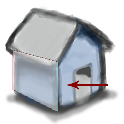
With the construction folder selected, press P to select the pen tool and draw a rectangle like shown below. (I applied a stroke to my shape so that I could easily see the contour lines).
The following steps are pretty straight forward, just keep using the pen tool to draw shapes as you trace around the sketch. Don’t be concerned if it is super accurate, just block out the shapes, you can always go back and adjust them later.
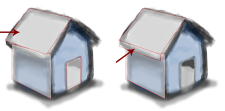
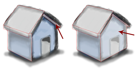
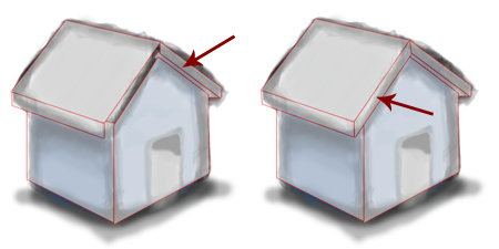
Draw the final door shape and you will have your sketch all blocked out in Photoshop. Congratulations!
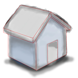
Part Four: Find the light source
I decided that the light would come from the side opposite the facing roof. I didn’t use any gradients, just solid colors (using brighter colors for parts that were illuminated and darker colors for parts that were in the shadows.)
I used the colors from my sketch as my palette. I kept the door black because. . .well . . .it’s a black door.
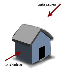
At this point you don’t need the sketch as a reference so go ahead and hide the sketch layer.
Part Five: Add Highlights
All right, I’m a big fan of glossy surfaces so let’s add a few highlights to spice things up a bit.
Keep your light source in mind as you add highlights.
Press P to select the pen tool, make sure that the color is set to white and draw a highlight like shown. Drag the opacity slider for this layer down to 17%.
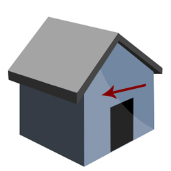
Add another highlight as illustrated and set its opacity to 35%.
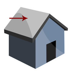
What is happening is the light is hitting the roof and then spilling over onto the other side and out front. I made it sharp because sharp edges create the illusion of a shiny surface.
Ok now that we have highlights let’s add some gradients to give it a more tangible feeling.
Part Six: Add gradients
Start by adding a vertical gradient to the left wall. Gradient settings and options don’t have to perfect here, just play around with it.
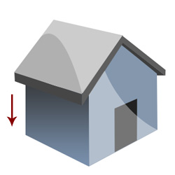
Now add another gradient to the roof of the building, remember that the light source is coming from behind so you’ll want it to go from white at the top and darker at the bottom.
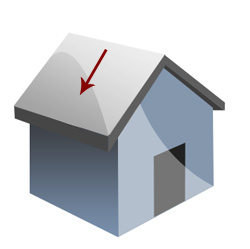
OK, for the final gradient, the light is hitting the roof and being partially blocked. So add add a small shadow on the front of the building.
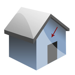
note:for more information about gradients, highlights and color in graphic design check out my Principles of Glossy Interface Design tutorial.
Lets add a shadow to this icon.
Part Seven: Add Shadows
Press L to select the polygonal lasso tool. Mark a selection under your icon and fill it with black. Don’t forget your light source!
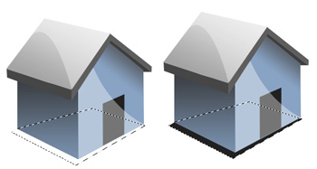
With that black shadow layer selected, go to Filter > Blur > Gaussian Blur. Adjust the radius until it looks similar to the picture. You may also need to nudge the shadow up a bit to prevent it from looking like the house is floating.
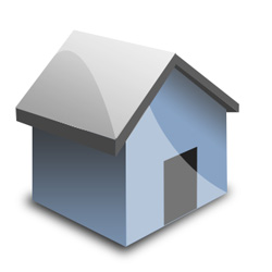
Part Eight: Tweak your heart out
Get up from your chair
To get started, a good strategy is to get up from your chair and step back about 10 feet. Look at the image and see if you notice anything that could use some improvement. No seriously. . do it, professional designers and artists do it all the time. You’ll be surprised at what you see.
Also try this trick, hold down Shift-Alt and scroll your middle mouse button. It should zoom in and out. This is a helpful zoom as it retains sharp edges.
My tweaks
Here I did an extra 15 minutes of tweaking on the icon. What will you come up with?

Imperfections are OK
If you look at the picture you’ll notice that there are slight mistakes. In the icon business though that’s OK Look at it now when I size it down to 64 x 64.

You can’t even see the imperfections can you? And that’s a big icon!
Conclusion
Don’t forget to always sketch out your drawings first, Photoshop takes a lot of time and it stinks when you spend a lot of energy on a project just for it to go no where.
If you have any questions or comments please post in my comments.
Good Luck!
« Previous 1 2
Comments
Post by AGMJ on June 2, 2007
Great just great! i think i just mastered a new technique :P
Post by rendra on June 2, 2007
good and incredible
Post by phreak on June 17, 2007
incredible nice! :D
Post by kezzy on August 15, 2007
nice one
Post by Muhammad Usama on April 13, 2008
Just Fantastic,This will encourage me to create Icons I couldn't even think about making. Thanks for this superb tutorial.
Post by Lucian on July 29, 2008
A good tutorial. Thanks !
Post by pedro on October 13, 2008
just want to say..: great tutorial!!;) really liked the way u explain things!;) congrats;)!
Post by xDetective on November 17, 2008
Amazng. I haven't tought that I can create an icon for my website with a paper and a pencil.
Post by eirini on February 28, 2009
loved the tutorial but i dont get one thing. when someone is gonna sketch a house for example it will not be exactly vertical so when he will go and use the pen tool at photoshop the final house will have some degrees difference from the floor. i mean the house will not be vertical with the floor. any suggestion for this please? thanks in advance
Post by webicongallery on March 5, 2009
great tutorial, featured it on http://webicongallery.com/professional-technique-for-creating-icons/
Post by playback on August 17, 2009
Nice tut! i need help with a logo, i have it sketched on paper but am finding it difficult 2 redesign in photoshop