Part Two: More complex Glossy Objects.
Close the previous project and create a new canvas with a width and height of 250 pixels.
Now using what I just taught you, make something that looks similar to this.
Now let’s make it a bit more interesting.
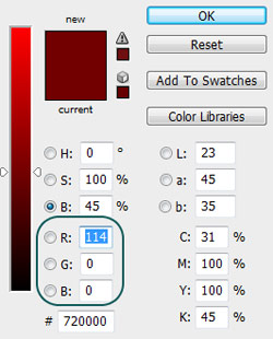
Double-click your shape layer and select stroke. Click B (for brightness) and drag the slider down a bit. I used these settings.
Press Ctrl and select the shape layer to make a selection mask.
Make a new layer above your shape layer and select that layer.
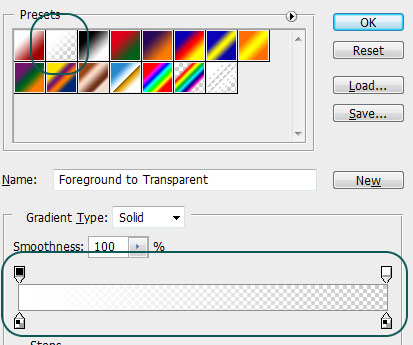
Press G and make sure that the gradient tool is selected. Also check to make sure that you have a white gradient going into transparent.
Inside your new selection draw a gradient going from the top to the bottom. Try this a few times until it looks
close to the picture. (notice the selection mask)
The effect is subtle. Notice that this gradient made it look slightly round.
Remember that sharp is shiny and gradient is grabbable.
Ok now we’re going to add some specular highlights, make sure that the white gradient that you just applied isn’t too bright otherwise we won’t be able to see them. Remember color is relative.
Take the pen tool and make some white shapes at spots where the light is brightest (usually at the corners and edges).
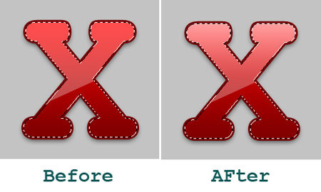
Take a look at what I did below. Notice how the shape starts to pop out a bit?
Ok so this is a good start but I think it still looks a bit flat. . let’s do something about that.
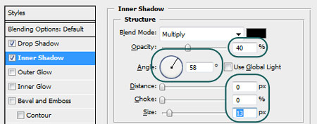
Double click your shape layer and select the Inner Shadow option.
Apply these settings.
Your object should look like this. Notice how the added shadows give it more depth? Also note that the light
is coming from the same direction.
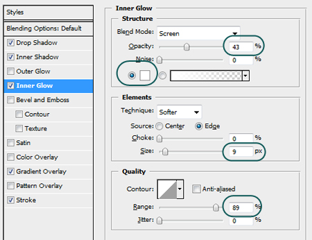
It has some good depth but we can do one more thing to really make it pop out. Go to the Inner Glow option and apply these settings and press OK
Notice the ring that appears around it. This is simulating back light, so the light source is coming from the top and slightly behind. Quite nice if you ask me.
Your final result should look like this.
Conclusion:
Go ahead and experiment with the glossy effect, get comfortable with it. Add some additional effects such as scan lines, text, logos etc.
So in conclusion remember that glossy effects are a simulation, an illusion of light. They are effects based on physics that exist in the real world. Always keep in mind the color and light source.
I hope you found this tutorial helpful, if you have any questions or suggestions feel free to contact me.
« Previous 1 2




Comments
Post by Slava on June 1, 2007
Nice !!!!! Really nice and easy!!!
Post by Seth on June 4, 2007
I love it!!!!!
Post by Lu on June 7, 2007
Excellent tutorial
Post by mandee on June 12, 2007
great maganda sya
Post by C– on June 14, 2007
Awesome! End result looks great! =)
Post by George on July 14, 2007
hi. i am stuck on first tutorial where it says: "With the transparent layer still selected...." I hold Ctrl and left click the shape layer i named Base but nothing happens. I use photoshop on mac Please help me, thank you
Post by xphunt3r on July 22, 2007
Nice Tutorial....Rocking
Post by Sunstorm on July 26, 2007
very very nice!!!! I love this style. I use it most of my e-commerce sites already!
Post by Michael on July 28, 2007
This is the second of PartDigitals Tutorials that make me feel absolutely stupid!The tutorials are fantastic, and the outcomes amazing.I have absolutely no idea in this tut how to go about making that X...I follow the first part fine but then..... :{I feel photoshop stupid ....I will go and find some Photoshop Tutorials for bozos and then come back here....
Post by b on September 4, 2007
there is no brightness whn you t ype b
Post by kamal on November 4, 2007
@George: make sure you made the rounded rectangle on a *different* layer with only that shape there (rest of the layer blank)... CTRL LMB should select the outline of this rounded rectangle.. or just go to the paths panel.. if you did not create any other paths yet.. you have that rounded rectangle as a _Workpath_ .. just CTRL Click (LMB) on that.. bingo!LMB = Left Mouse Button.Yeah, it works for Mac too ;-)
Post by brumpton on December 4, 2008
Thanks for explaining the theory behind the steps used to make something glossy. I have a much better understanding of the basics now.
Post by Jonny Wood on March 1, 2009
A good tutorial technically but I wonder when this phase of glossy design is going to end...? Everything now has this high sheen gloss look which people seem to love. Not me I'm afraid. Well written tutorial though.