There are many glossy button and shape tutorials on the internet. These tutorials are useful but I’ve found that they all tend to be a one trick pony. That is, you couldn’t do much with them outside of the tutorial. So I’m going to go ahead and explain just what it takes to make something glossy.
What you will need
- Adobe Photoshop
Part One: The Basics.
Let’s do a quick tutorial first; this will get you familiar with some of the basic principles of glossy design.
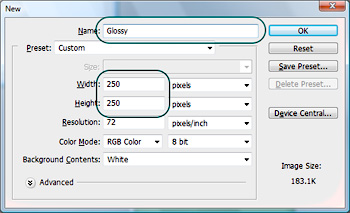
Create a new canvas with the following settings.
Double click the background layer, a popup window will show up. Press OK to unlock the layer.
With the layer still selected, press Shift-F5 (or go to Edit > Fill), change the drop down menu to Foreground Color and click OK. This will fill your canvas with an olive green color.
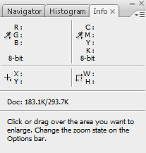
Press F8 to open up the info palette (or go to window > info).
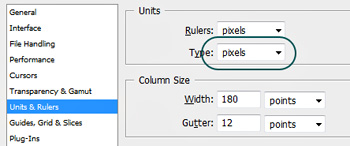
Make sure that your units are set to pixels. If they aren’t, press Ctrl-K (or go to Edit > Preferences > General), select Units and Rulers and change Type to pixels.
Click OK
Press U to select the shape tool. Make sure that the Rounded Rectangle Tool is selected with a corner radius of 15px.
With your eye on the info palette, drag out a shape that is about 200 x 50 pixels.
Name this shape Base
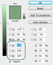
Double-click your shape layer, a color picker will popup. Change your RGB values to 117, 153,163 respectively. Hit OK.
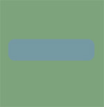
You should have something that looks like this.
Make a new layer above your shape layer.
Press M; make sure that the Elliptical Marquee Tool is selected. Draw an ellipse on top of your shape.
Press Shift-F5 (or go to Edit > Fill)and select White from the drop down list, this will fill your selection with white.
Drag the opacity slider on this layer to 30%.
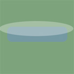
It should look something like this.
With the transparent layer still selected, hold Ctrl and left click the shape layer you named Base, this will create a selection mask around your shape.
Press Ctrl-Shift-I (or go to Select > Inverse), then click delete. This will delete the remaining white.
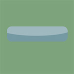
You should have something that looks like this. It’s already looking a little glossy.
Select your shape layer (named Base) and then select the little F at the bottom of the layers palette. Select Gradient Overlay from the menu.
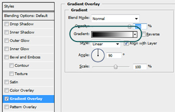
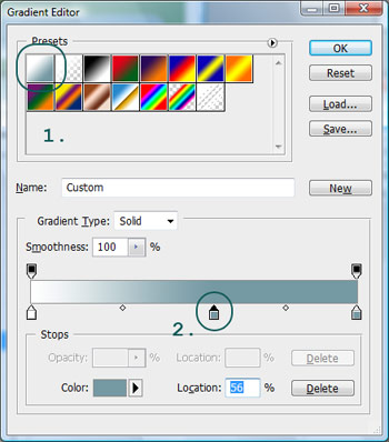
Click the Gradient Color Bar to get additional gradient options.
Select the swatch in the top left hand corner, we’re going to modify this a little bit.
With the new swatch selected select the gradient color on the far right and then click in the middle of the
gradient to create a new copy of it.
Select the white gradient color on the left and drag it off the gradient bar to remove it.
Drag your new gradient color to the far left, you should now have a solid color.
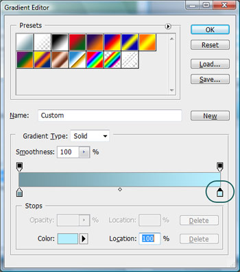
Double-click the gradient on the right, a color picker should pop up. Click B (for Brightness) and drag the slider all the way up.
The gradient window should look like this now.
Click OK
Then click ok again to exit out of the gradient dialog.
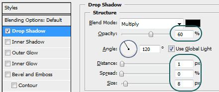
From the Layer Style window click Drop Shadow and apply these settings.
Click OK
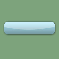
You’ve now created a basic glossy button!
Ok in the tutorial we just did we tackled some of the basic principles of Glossy Design. Those principles are:
- Base Color (Very important)
- White Transparency (Very important)
- Gradients (You guessed it, also very important!)
We also added a drop shadow, this isn’t crucial but it helps.
Why are these important?
Base Color:
The base color as you might expect is the foundation for the interface. It creates a surface for the gradient and
white transparency layer to play off of.
White transparency:
The white transparency is an interesting phenomenon. It simulates specular highlights. Generally the sharper the shape the shinier the object.
Gradient:
The gradient is what gives the shape it’s volume. It simulates depth and creates the illusion of a tangible object.
So remember these two things:
- Sharp is shiny
- Gradation is grabbable.
Why do these work?
In the real world we are encountering shiny objects all the time. From cars to forks to gumballs. Our mind is very comfortable seeing these things. There are only two things that make something look shiny. Light and surface.
Look at what you just created, notice how the gradation is bright at the top and darker at the bottom? That’s because our simulated light source is above the object. That was also the reason that I put the specular highlight (white transparency) there.
So whenever you work with glossy ask yourself these three questions:
- What color will my shape be?
- Where is the light coming from?
- How shiny is my object?
Now let’s start making some more complex glossy objects. . .
Comments
Post by Slava on June 1, 2007
Nice !!!!! Really nice and easy!!!
Post by Seth on June 4, 2007
I love it!!!!!
Post by Lu on June 7, 2007
Excellent tutorial
Post by mandee on June 12, 2007
great maganda sya
Post by C– on June 14, 2007
Awesome! End result looks great! =)
Post by George on July 14, 2007
hi. i am stuck on first tutorial where it says: "With the transparent layer still selected...." I hold Ctrl and left click the shape layer i named Base but nothing happens. I use photoshop on mac Please help me, thank you
Post by xphunt3r on July 22, 2007
Nice Tutorial....Rocking
Post by Sunstorm on July 26, 2007
very very nice!!!! I love this style. I use it most of my e-commerce sites already!
Post by Michael on July 28, 2007
This is the second of PartDigitals Tutorials that make me feel absolutely stupid!The tutorials are fantastic, and the outcomes amazing.I have absolutely no idea in this tut how to go about making that X...I follow the first part fine but then..... :{I feel photoshop stupid ....I will go and find some Photoshop Tutorials for bozos and then come back here....
Post by b on September 4, 2007
there is no brightness whn you t ype b
Post by kamal on November 4, 2007
@George: make sure you made the rounded rectangle on a *different* layer with only that shape there (rest of the layer blank)... CTRL LMB should select the outline of this rounded rectangle.. or just go to the paths panel.. if you did not create any other paths yet.. you have that rounded rectangle as a _Workpath_ .. just CTRL Click (LMB) on that.. bingo!LMB = Left Mouse Button.Yeah, it works for Mac too ;-)
Post by brumpton on December 4, 2008
Thanks for explaining the theory behind the steps used to make something glossy. I have a much better understanding of the basics now.
Post by Jonny Wood on March 1, 2009
A good tutorial technically but I wonder when this phase of glossy design is going to end...? Everything now has this high sheen gloss look which people seem to love. Not me I'm afraid. Well written tutorial though.