Part Three: Setting the foundation.
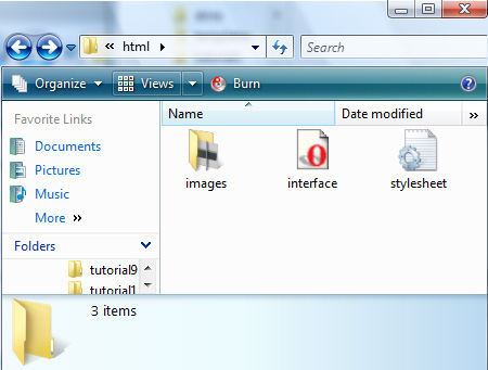
Create two new files and name them interface.htm and stylesheet.css respectively.
Your project folder should look like this.

Note: Given the nature of operating systems, your icon graphics may not resemble mine.
Note: Creating web interfaces is a rather complicated process, therefore I’m not going to go into every little detail but rather highlight the most important aspects of html and css.
Copy the following code and paste it into your interface.htm document.
<!-- this sets the doc type -->
<!DOCTYPE HTML PUBLIC "-//W3C//DTD HTML 4.01 Transitional//EN" "http://www.w3.org/TR/html4/strict.dtd">
<html>
<head>
<title>My Interface</title>

<!-- linking your stylesheet document -->
<link rel="stylesheet" type="text/css" href = "stylesheet.css"  media="screen"  />

</head>
<body>

</body>
</html>
Now with this html code in, it’s time to think about how the layout is going to work.
Before you do any real CSS, think about the logic that you’re going to use. It’s best to have a picture in your
mind before you start rather than begin with little thought as it’s easy to work yourself into a corner.
helpful tip: When writing CSS, it’s best to start broad and then become more specific as you go along. (Just like painting a picture).
Copy and paste this code into your html document between the body tags.
<!--
Start by blocking out the major sections of the website.
Create the site wrapper, header, body etc.
-->
<!--
Site Wrapper
Always create a site wrapper, this helps with the overall size and position of your website.
-->
<div class="site-wrapper">

<!--
Header Wrapper
This is where the logo, site title and top navigation will go
-->

<!--
Body Wrapper
this section is what holds the left navigation, center content and right panels
-->

<!--
Footer
as you might expect, this is the footer
--></div>
I can’t stress enough how important this first step is. It provides the structure that the rest of your components will build on. You wouldn’t trust a house with a shaky foundation would you? The same applies here.
Copy and paste the following code into stylesheet.css
/*==============================
GLOBALS
Sets the default document font size, family
and color
===============================*/
body
{
font-family:Arial;
font-size:12px;
color:#3f4a4e;
}
/*==============================
SITE WRAPPER
===============================*/
.site-wrapper
{
width:800px;

/* min-height lets your site grow vertically
(like in tables). */
min-height:600px;

/* By setting these to auto you are centering the
site */
margin-left:auto;
margin-right:auto;

border:solid 1px black;
}
/*==============================
HEADER WRAPPER
===============================*/
.header-wrapper
{
width:800px;
height:54px;

background:url('images/header_bg.gif');

/* css lets you designate how you want an image to
repeat. Along the x-axis, y-axis or not at all. */
background-repeat:repeat-x;
}
/*==============================
BODY WRAPPER
===============================*/
.body-wrapper
{
margin-top:3px;

/* floats are crucial to the creation of any
web interface. Every web developer must master
this concept. Don't worry I'll be writing a
tutorial about this a little later.		*/
float:left;

width:800px;
min-height:530px;
}
/*==============================
FOOTER
===============================*/
.footer
{
/* clears are the sisters to float, it's
time to meet the whole family  */
clear:left;
height:16px;
background:url(images/footer.gif);
}
Note: In the early stages of production like this, I highly recommend that you put a border on every block element (div, table, h1, h2 etc. . ) that you create. It is much easier to visualize.
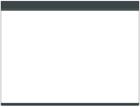
Open interface.htm in your browser, it should look something like this.

Now that we have a good base, let’s build the header.
Part Four: Building the Header
Paste the following code into interface.htm inside the header-wrapper tags.
<div class="header-title"><img src="images/header_title.gif" alt="" /></div>
<div class="header-menu">

<!-- making an HTML list -->
<ul>
<li><img src="images/icon_home.gif" alt="home" /></li>
<li><img src="images/icon_tutorials.gif" alt="tutorials" /></li>
<li><img src="images/icon_downloads.gif" alt="downloads" /></li>
<li><img src="images/icon_resume.gif" alt="resume" /></li>
<li><img src="images/icon_links.gif" alt="links" /></li>
<li><img src="images/icon_contact.gif" alt="contact" /></li>
</ul>
</div>
Above I created a list of images. Normally lists are displayed as vertical, bulleted entries but with a little CSS magic we can turn it into a nice horizontel menu. Take a look at it now in the browser before you go to the next step.
In stylesheet.css, under header-wrapper, copy and paste the following code.
/* this sets the position of the title.
header.gif goes here here */
.header-title
{
float:left;
}
/* This sets the position of the menu */
.header-menu
{
float:right;
width:370px;
height:54px;
}

/*  The Menu  */
/*Whey you follow a class definition with an html element (such
as ul) all styles that you apply will only affect that element.
So for instance, in this case you read it as "apply these
settings to every ul html element inside every div tag named
<strong>header-menu</strong>, but no other."
*/
.header-menu ul
{
padding:0;

/* the removes the left margin */
margin:0;

/* this removes the bullet */
list-style:none;
}
.header-menu li
{
float:left;
}
The header menu should look like this.

Now let’s move on to the portfolio navigation.
Part Five: Building the portfolio menu.
Copy and paste the following HTML into interface.htm between the body-wrapper div tags.
<div class="portfolio-menu">
<h2>portfolio</h2>
<ul>
<li><a>In Progress</a></li>
<li><a>Design</a></li>
<li><a>3D</a></li>
<li><a>Traditional</a></li>
</ul>
</div>
Believe it or not that’s all the html code you need to make the menu! Now let’s do some CSS.
Copy and paste this into stylesheet.css
/*==============================
PORTFOLIO MENU
===============================*/
.portfolio-menu
{
float:left;
/*The width of the menu */
width:140px;
min-height:530px;

/*The font of all the text in the menu */
font-family:Arial;
}

/*The Portfolio Title */
.portfolio-menu h1
{
margin:2px;
color:#3f4a4e;
font-size:18px;
}
/* Like before we just apply some styles to the list */
.portfolio-menu ul
{
margin:0;
padding-left:15px;
list-style:none;
}
/* We have to apply a style to the links in the list, otherwise
they will default to the browser standard. (which is normally
blue with an underline.) */
.portfolio-menu a
{
font-size:12px;

/* text-decoration removes the underline */
text-decoration:none;

color:#3f4a4e;
}
.portfolio-menu li
{
background:url(images/triangle-idle.gif);
background-repeat:no-repeat;
background-position:center left;
margin-bottom:5px;
padding-left:15px;
border:solid thin black;

}
/* hover is a pseudo class, you can set styles for when
the user puts their mouse over an element. No Javascript
needed! */
.portfolio-menu li:hover
{
background:url(images/triangle-active.gif);
background-repeat:no-repeat;
background-position:center left;
}
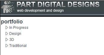
Save the document and view it in the browser, the menu should look like this.

Ok now let’s build the center content area.
Part Six: Building the content area
Note: I’m not going to completely recreate the content inside the panels because these sections are dynamic and they would be populated at run time. Instead I’ll show you have to create the panel make them ready to handle content.
Copy and paste the following into interface.htm under portfolio-menu make sure that it’s still between the body-wrapper tags.
<!-- Holds the panel -->
<div class="content-wrapper">

<!-- The panel -->
<div class="panel">
<div class="panel_title">home</div>
</div>
</div>
Copy and paste the following into stylesheet.css under portfolio-menu
/*==============================
CONTENT-WRAPPER
===============================*/
.content-wrapper
{
float:left;
width:470px;
margin-right:5px;
}
/*==============================
PANEL CONTENT
===============================*/
.panel
{
margin-bottom:5px;
border:solid 1px #869ca4;
}
/*The panel content */
.panel_content
{
padding:2px;
background:#effaff;
}
/* The panel title */
.panel_title
{
height:16px;
font-size:14px;
color:#effaff;
padding:2px;
padding-left:4px;
background:url(images/panel_bg.gif);
background-repeat:repeat-x;
background-position:center center;
}
Ok now let’s create the two right panels, you’ll find that this step is very easy.
Part Seven: Creating the right panels.
Copy and paste the following into interface.htm right after the content-wrapper div tag.
<div class="right-wrapper">
<div class="panel">
<div class="panel_title">news</div>
<div class="panel_content" style="height: 210px;">Your content for news goes here.</div>
</div>
</div>
<div class="panel">
<div class="panel_title">tutorials</div>
<div class="panel_content" style="min-height: 210px;">Your content for tutorials goes here.</div>
</div>
Copy this into stylesheet.css after panel_title
/*==============================
RIGHT WRAPPER
===============================*/
.right-wrapper
{
float:left;
width:180px;
min-height:530px;
}
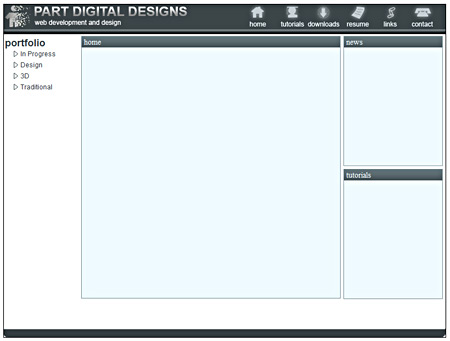
Take a look at the interface in the browser. Congratulations! You have all your menus and content areas ready for the world wide web!
Conclusion
In this tutorial I’ve introduced you to some very useful and important concepts.
- Separating your layout from your styles.
- Using div tags to block out your layout.
- Using wrappers to hold your sections.
- Using lists to create menus
These are constantly recurring techniques, use them, become comfortable with them.
I hope this was helpful, if you have any questions or suggestions feel free to contact me.
I’m accepting requests. If any of you have a question about Photoshop or PHP and would like to see a tutorial, send me an email here. Make sure that you put “request” in the subject.
« Previous 1 2

Comments
Post by PSD to HTML on November 4, 2009
Nice tutorial, but you havn't mention how to make tableless websites..., Thanks! Jitesh
Post by Anonymous on January 27, 2010
Great tutorial. I was curious how designers turned PSD mockups into functional pages. Also "The Horizontel line between sections in the body." should be horizontal*. :)
Post by Laurence Stremlow on March 5, 2010
Dreamweaver has been for a while my goto application for years. I really don't know what I would undoubtedly do with out it. There were periods when I first started out making use of the program, and I thought it was way too complicated. Now I fly around it, and it has grown to be a great asset in my tool box. Nonetheless thanks for the write-up.
Post by pargo on March 23, 2010
Very good explained. But it doesn't work. I the end the content area is a mess. I guess you've forgot to write something about the content-wrapper divs. Thanks.
Post by Hannelore Gonazlez on May 28, 2010
When I design a sight I design first and code second. I find that using pure CSS layout , like an obnoxious backseat driver, often ends up stearing the design a little bit in the end. This is most often a problem when floating elements inside a centered div - the darn footer elements colapse upwards; don't float use positining and margins? Crossbrowser catastrophe! Usually one simple table takes care of so many things.
Post by John on August 15, 2010
Absolutely excellent! For a long time I've known HTML and CSS, but have never quite gotten the hang of doing both from scratch on a PSD design. Thank You!
Post by Duc Thai on August 20, 2010
Really nice tutorial. I have a question. From Photoshop, how do i get all styles to build the stylesheet file?
Post by Sicko on October 11, 2010
Thanks! I also added ".content-wrapper .panel_content" style with min-height:451px.
Post by admin on March 25, 2011
Hello Ahmad, could you tell me which errors you are referring to? Thanks!
Post by Bill K on September 15, 2011
Great tutorial. I really learned a lot. There were a few issues I ran into. They're simple mistakes I'd imagine were made while transcribing the steps into tutorial format. (I could be wrong, of course. And I only bring them up because I think others may have had these issues as well. Certainly nothing personal.): 1. - For Part Five, in the HTML under the , you have the title as portfolio... but in the CSS, you only have .portfolio-menu h1 ... there isn't any specifications for .portfolio-menu h2. This is easily fixed by changing the tags in the HTML to tags. 2. - For Part Seven, in the HTML on line 05 and 06 you have an extra , I think. The two panels in the "right-wrapper" weren't displaying correctly, but they did when I removed the extra Anyway, thanks again for the tutorial. I actually learned even more having to troubleshoot these parts. -Bill