Raising the bar
I’m always trying to push myself to produce a better quality product. This applies for the work I do for my clients and for myself. Therefore every 8 months or so I feel motivated to give my website a face lift. I thought I would share what my website has looked like over the last two years.
Part Digital Design 1.0
This was the first version of my website, I did it in the winter of 2006. if I remember correctly it was finished in about three days or so. I was pretty happy with it and when I asked people what they thought of it no one said what they should have said. . . that it was terrible. But hey it was a good learning experience.
At the time the website was simply called PartDigital.com and had very little consideration (ok there wasn’t ANY consideration) for SEO. It was also built before I had ever heard of anything called a framework.
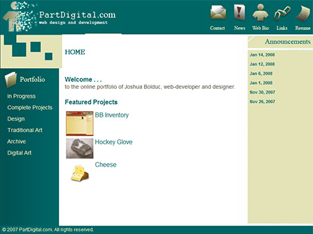
My first portfolio in all its glory
As you can see the general layout of the website hasn’t changed at all.
The tutorials section hadn’t been added yet either, it was just a simple portfolio site to get my work out there.
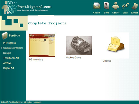
I didn't have a lot of projects back then. . .
The portfolio page consisted of a simple table and dynamic resizing images. I didn’t save the thumbnails to the server because I didn’t like the extra files. It didn’t really bother me that generating thumbnails every single time killed the performance of my site.
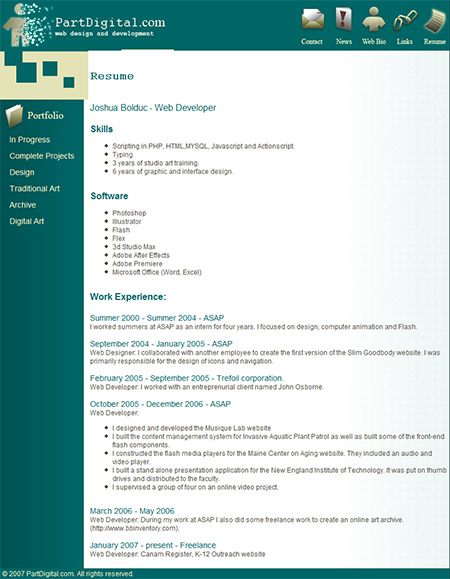
My Resume page hasn’t changed that much either. In fact I think I’ve used the same file for all my websites I just modified it a bit as I got new projects.
Ahh my website has come a long way. When I opened up the old site for the first time in nearly two years I laughed hysterically.
Part Digital Designs 2.0
Shortly after I released the first one (about 3 months in fact) I released version 2.0. I really didn’t like the look of the interface, it felt rushed and amateurish. I built the new version using the same techniques that I had used earlier and I even built a rudimentary CMS (content management system).
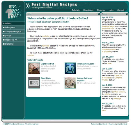
Ahh, much better
The layout hasn’t changed I just spent more time and energy to make it look better.
One of the big things that was missing from this version was the ability to go back to the home page. I never included a link. I don’t really know why I just never got around to it.
I spent a lot of time with this interface. I redid it three times (always using the same interface) and built my first framework, now called DigiFramework around it.
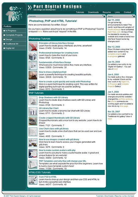
Who doesn't like tutorials?
I released tutorials with this version and signed on with Google Adsense to make me some money. This website has paid for itself over and over again. Thanks to all my readers :).
This website also had a more advanced Content Management System than version 1.0 though because of client work and just general laziness I didn’t spend the kind of time on it that it needed. The front end had similar issues, it didn’t look good in Internet Explorer 6.0 and the caching system wasn’t very efficient.
Part Digital Design 3.0
My third version really represented a major milestone in my design abilities. I built it on my new framework architecure and only took two months to complete.
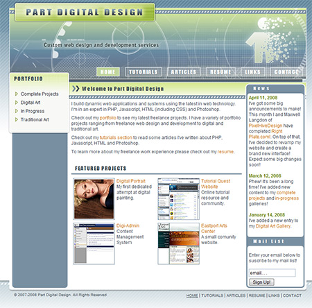
mmmm shiny :)
Part Digital Design 4.0
By January, 2009, it was turning into a blog which was hurting my business audience. Therefore, I decided to break it into two websites.
To keep my tutorial audience I built this blog.
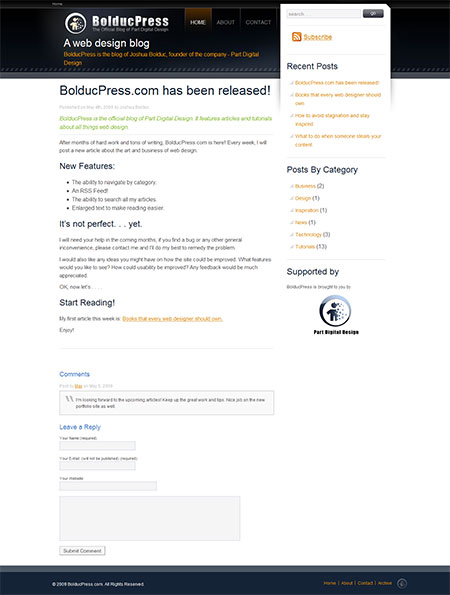
My new blog
I didn’t want the design of the interface to overpower the content so I kept the new design more subdued.
Then I created my business website and renamed the domain from Partdigital.com to Partdigitaldesign.com.
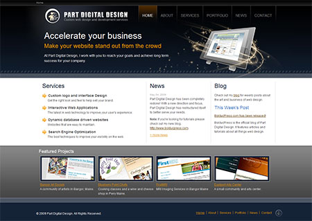
All business, no articles here :)
To Be Continued. . .
This article will be revised and expanded as new events unfold so come back again soon or sign up for my mail list.