What you will need
- A paper and pencil. . .really
- Adobe Photoshop
The Source Files:
Part One: Think of an idea
I have an idea. . . . .let’s do a home icon! OK moving on.
Part Two: Sketch out your idea
Before I begin any creative project I always make a sketch, whether it is a literal sketch with pencil and paper or a written description. It’s crucial to get your ideas out first so that you aren’t simultaneously trying to come up with ideas while you’re tackling with the technical aspects of creating it (such as getting the gradient tool to work).
Take out a piece of white paper (8.5 x 11 is good) and a pencil.
Start sketching out some ideas for a home icon. How big is the building compared to the roof? Is there a door? Windows? Think about all of these things as you sketch, don’t worry about making the drawings perfect. (If they communicate your idea to you then that’s all you need.)
My sketches
Take a look at the sketches below to see my process.
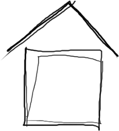
At first I thought I would go with a 2-d look but after drawing this I felt I could do more.

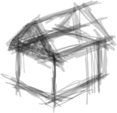
I did another sketch, this time with a 3-d look. I liked the direction I was going in but I didn’t like the orientation of the roof and I felt the building was a bit too long.

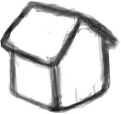
I thickened the lines and made the roof small compared to the building to give it a more cartoon feeling.

So now that I had a shape that I was happy with, I took some more time to develop my idea further. I also began experimenting with color composition.

Make sure you have a strong silhouette
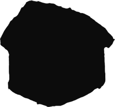
Before making your final decision about the sketch it’s a good idea to see if the line of action or silhouette is strong. Remember that this icon is going to be very small and a strong contour is important.
Notice that even without all the extra information you can still tell that it’s a building. In this case I even asked my brother to come and tell me what this looks like.

Now let’s open Photoshop. . .
Comments
Post by AGMJ on June 2, 2007
Great just great! i think i just mastered a new technique :P
Post by rendra on June 2, 2007
good and incredible
Post by phreak on June 17, 2007
incredible nice! :D
Post by kezzy on August 15, 2007
nice one
Post by Muhammad Usama on April 13, 2008
Just Fantastic,This will encourage me to create Icons I couldn't even think about making. Thanks for this superb tutorial.
Post by Lucian on July 29, 2008
A good tutorial. Thanks !
Post by pedro on October 13, 2008
just want to say..: great tutorial!!;) really liked the way u explain things!;) congrats;)!
Post by xDetective on November 17, 2008
Amazng. I haven't tought that I can create an icon for my website with a paper and a pencil.
Post by eirini on February 28, 2009
loved the tutorial but i dont get one thing. when someone is gonna sketch a house for example it will not be exactly vertical so when he will go and use the pen tool at photoshop the final house will have some degrees difference from the floor. i mean the house will not be vertical with the floor. any suggestion for this please? thanks in advance
Post by webicongallery on March 5, 2009
great tutorial, featured it on http://webicongallery.com/professional-technique-for-creating-icons/
Post by playback on August 17, 2009
Nice tut! i need help with a logo, i have it sketched on paper but am finding it difficult 2 redesign in photoshop